
One of the defining public health concerns of the twenty-first century is the increasing prevalence of mental health challenges. Across the world, millions of people are living with anxiety disorders, depression, post-traumatic stress, grief, emotional exhaustion, panic disorders, and loneliness. Many carry burdens that are invisible to the eye. For countless individuals, the Church remains one of the few places where they seek comfort, healing, acceptance, and hope.
This reality presents a pastoral responsibility that extends beyond preaching alone. While the Gospel is communicated primarily through the Word of God, the environment in which that Word is proclaimed also contributes to the worshipper’s experience. Architecture, lighting, music, cleanliness, colour harmony, and the appearance of those who minister all combine to create a first impression before a sermon begins.
Researchers in colour psychology and environmental design have long recognised that colours influence mood, perception, attention, and emotional response. Although reactions vary according to culture, personality, and personal experiences, colours have the capacity to shape how people perceive an environment. For this reason, thoughtful use of colour has become an important consideration in hospitals, schools, hospitality, counselling centres, and other places where emotional well-being is a priority.
The Church should not be indifferent to these realities. If careful attention is given to acoustics, lighting, architecture, and music in order to enhance worship, then thoughtful consideration may also be given to colour and visual presentation as part of creating an atmosphere that reflects the hope of the Gospel.
The Symbolism of Colour in Christian Ministry
Throughout Christian history, colours have carried symbolic meaning. White has traditionally represented purity, holiness, victory, and resurrection. Gold has symbolised divine majesty, excellence, and the glory of God. Green reminds believers of life, growth, renewal, and perseverance. Purple has long been associated with preparation, repentance, dignity, and royalty. Blue often evokes peace, faithfulness, heaven, and divine protection.
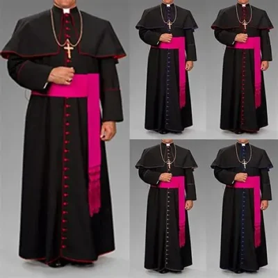
Black occupies a unique place within Christian tradition. In several historic churches, black clerical attire symbolises humility, simplicity, discipline, solemnity, and self-denial. Its purpose has never been to represent evil or spiritual darkness.
At the same time, in many societies black is also associated with mourning, bereavement, grief, mystery, and loss. Because worshippers come from different cultural backgrounds and personal experiences, they may not all perceive the same colour in the same way. This reality calls for pastoral sensitivity rather than rigid conclusions.
The question, therefore, is not whether black is inherently wrong. Rather, it is whether ministers should carefully consider how their overall presentation—including colour combinations, lighting, and worship settings—may influence those who come seeking encouragement and hope.
The Church Environment Should Reflect the Light of Christ
Jesus Christ declared: “I am the Light of the World.” Throughout Scripture, light consistently represents God’s presence, truth, hope, life, and salvation.
For this reason, the physical environment of Christian worship should intentionally reflect these biblical truths. A clean sanctuary, appropriate lighting, orderly decoration, and harmonious colours help create an atmosphere that welcomes rather than intimidates. Reverence need not be expressed through gloom, nor solemnity through darkness.
The altar should inspire awe because of God’s presence, not because of an atmosphere that appears cold, oppressive, or emotionally distant. Visitors entering a church for the first time should immediately perceive warmth, peace, order, and hope.
In an age when many people are searching for emotional healing, churches should strive to ensure that every visual element supports the message being proclaimed.
Colour Choices and the Ministry of Encouragement
The Gospel is fundamentally a message of life, redemption, forgiveness, restoration, and hope. Ministers therefore have an opportunity to reinforce these themes not only through faithful preaching but also through thoughtful presentation.
This does not require extravagant fashion or luxurious garments. Rather, it calls for wisdom.
Colours that many people commonly associate with peace, purity, joy, renewal, dignity, and hope may help reinforce the welcoming nature of Christian worship.
White, cream, gold, blue, green, purple, and well-coordinated neutral colours often create an atmosphere of warmth while preserving reverence.
Conversely, ministers should exercise discernment when choosing colour combinations that may appear excessively sombre, particularly in settings intended to communicate celebration, encouragement, and the joy of salvation.
The objective is not to prescribe a compulsory colour code for clergy but to encourage thoughtful reflection. The Church exists to remove unnecessary barriers to the Gospel. If every aspect of worship can help communicate Christ’s love more effectively, then careful attention to appearance becomes another expression of faithful pastoral care.
. Mabeek writes from Lagos